Share this post:
I launch ambitious trailblazers to next level success through high-converting gorgeous websites that ignite their influence, impact, and income.
I had the absolute privilege of designing a brand new Showit website for Teresa Quadres Therapy, and we are both in LOVE with the final result! Go check out Teresa’s new therapy website at TeresaQuadres.com.
Teresa is one of the most beautiful, heart-centered client’s I’ve worked with. She’s the reason I discovered my love and passion of working with Therapists….because it gives me the opportunity to be a part of their calling, their cause, the impact they are making on the lives of so many. I want nothing more than to champion them on and help them align, amplify, and ignite their impact on the world.
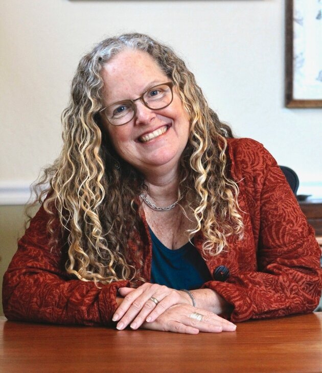
“I don’t even have words for how far the final website surpassed my expectations and blew past my goals…My original website was totally DIY, created with no background in design, branding or SEO. The new website, in contrast, is like a work of art that beautifully represents what I want to offer the world with my business. I was truly astonished at the final result: every single detail resonated with my deepest intentions for my work.”
– Teresa Quadres
New Therapy Brand & Website Goals
It was time for Teresa to ditch the SquareSpace DIY site for a real deal professional therapist website she could confidently and proudly send prospect clients to; one that would make her stand out online as the high worth, valuable professional she is. She wanted a website that would finally(!!!) represent HER and this therapy practice she’s built in a unique, authentic, personality-packed way. Teresa was also ready to pivot her private practice to serve a new purpose and a new audience and needed on online home that would grow with her vision for her private therapy practice. She also wanted a space to provide free resources and content to help people, especially those who could not afford to work with her.
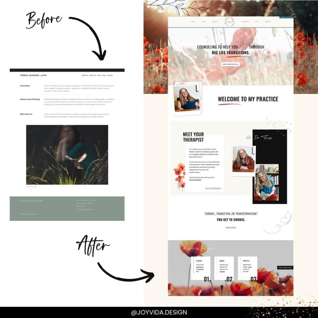
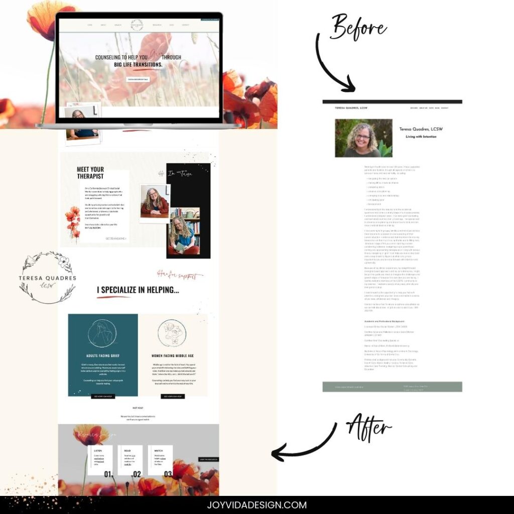
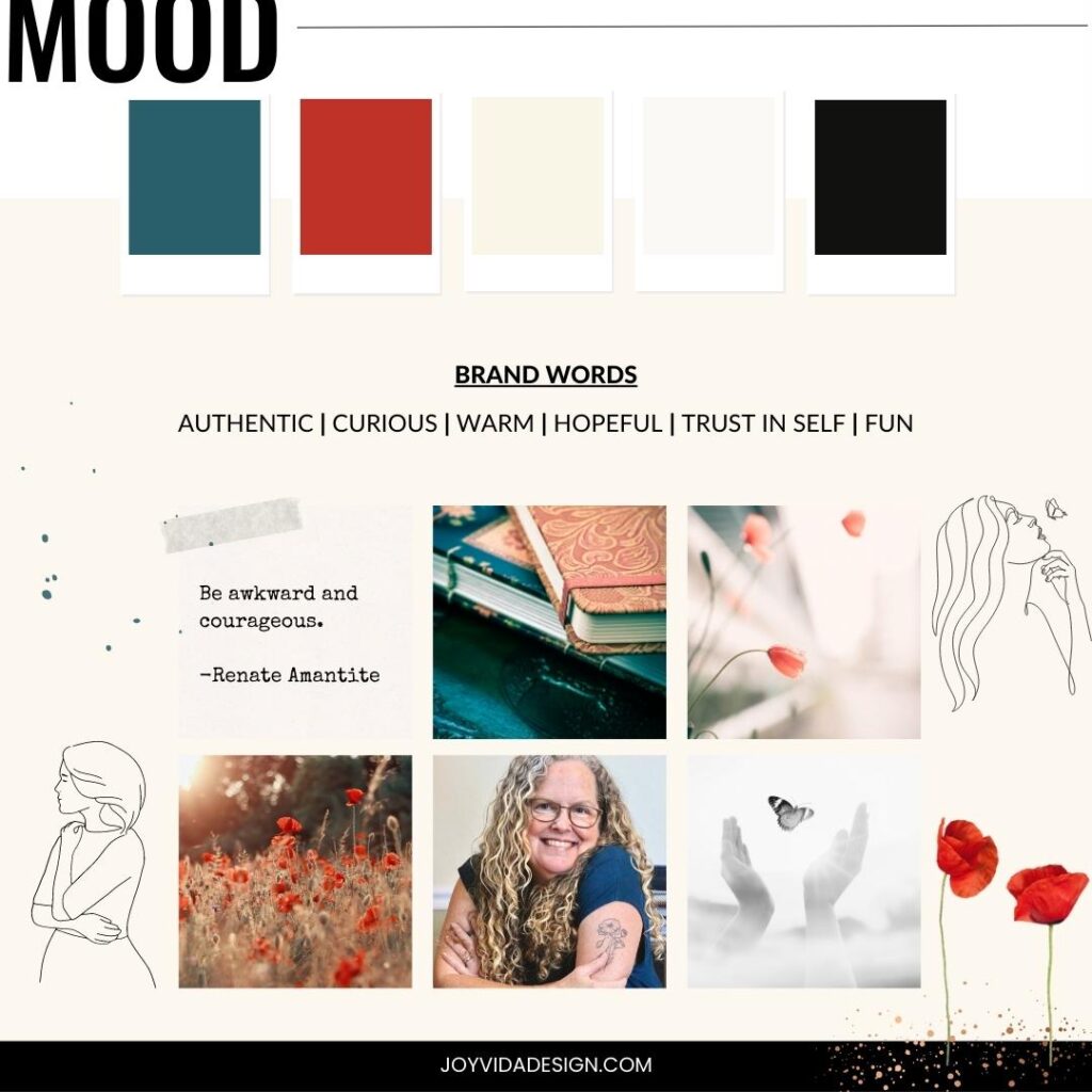
Step 1: Therapy Branding – Mood Boards
“I don’t want my new website to look like ALL the others with their boring & predictable, calm, seascape pastel colored therapy websites. (*eye roll) I want mine to be unique, authentic, full of personality and highlighting the theme of personal transformation through poppies growing from seeds in the dark underground to living in full bloom, and from the transformational journey of caterpillar to butterfly.”
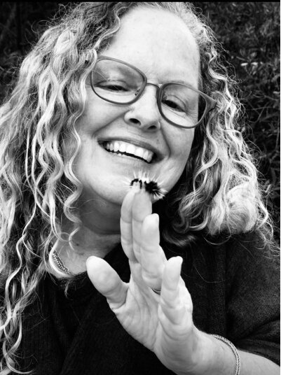
Through my brand clarity guide and our 1:1 meetings, she gained clarity on her new target audience that was truly aligned with who she wanted to work with in this new chapter of her practice: women facing middle age and adults facing grief; both of whom are going through big life transitions. She also gained clarity on how she wanted to position herself and her brand to speak and connect with them while rooting in her authenticity.
Next, we created some brand mood boards to get an aligned vision for the look and feel of her brand and website including the color pallet.
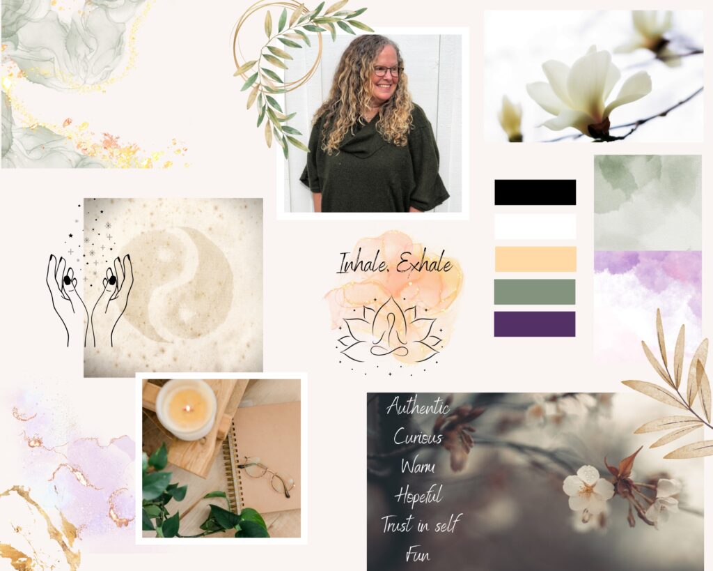
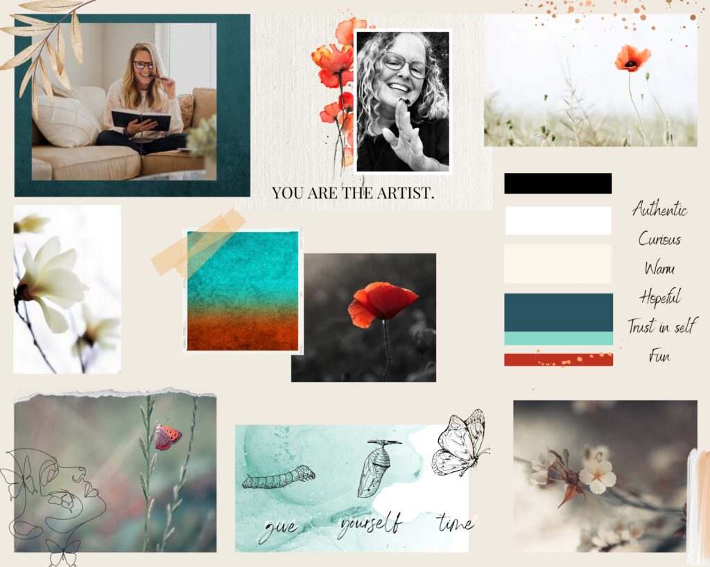

Step 2: Therapy Branding – Brand Guidelines
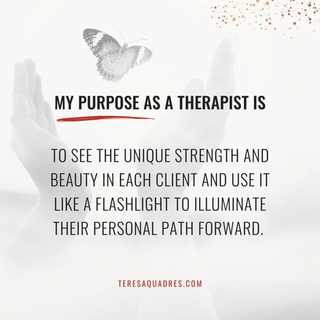
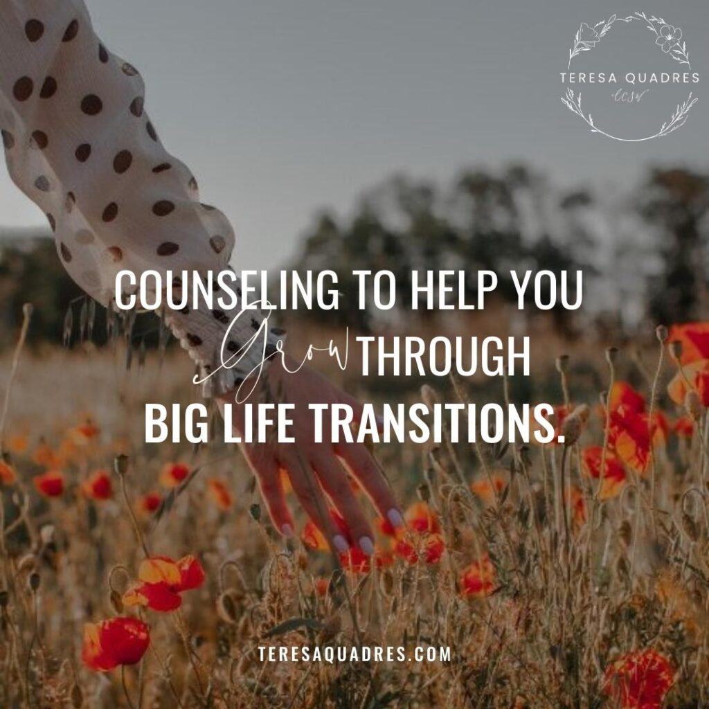
With the mood board dialed in, we brought her complete new business personality to life and created a visual brand identity (mood board, font selection, color pallet) which she’ll use as a guide for future marketing material, to ensure her brand is cohesive across all platforms, making her business look polished, professional, and trustworthy.
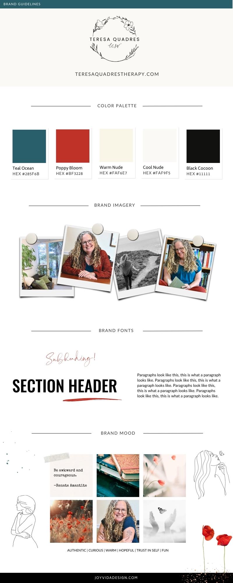
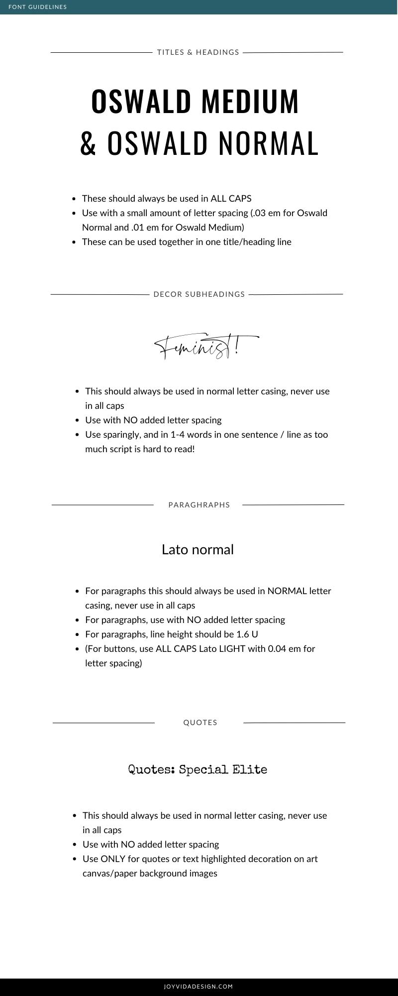
Step 3: Therapy Website Content Strategy
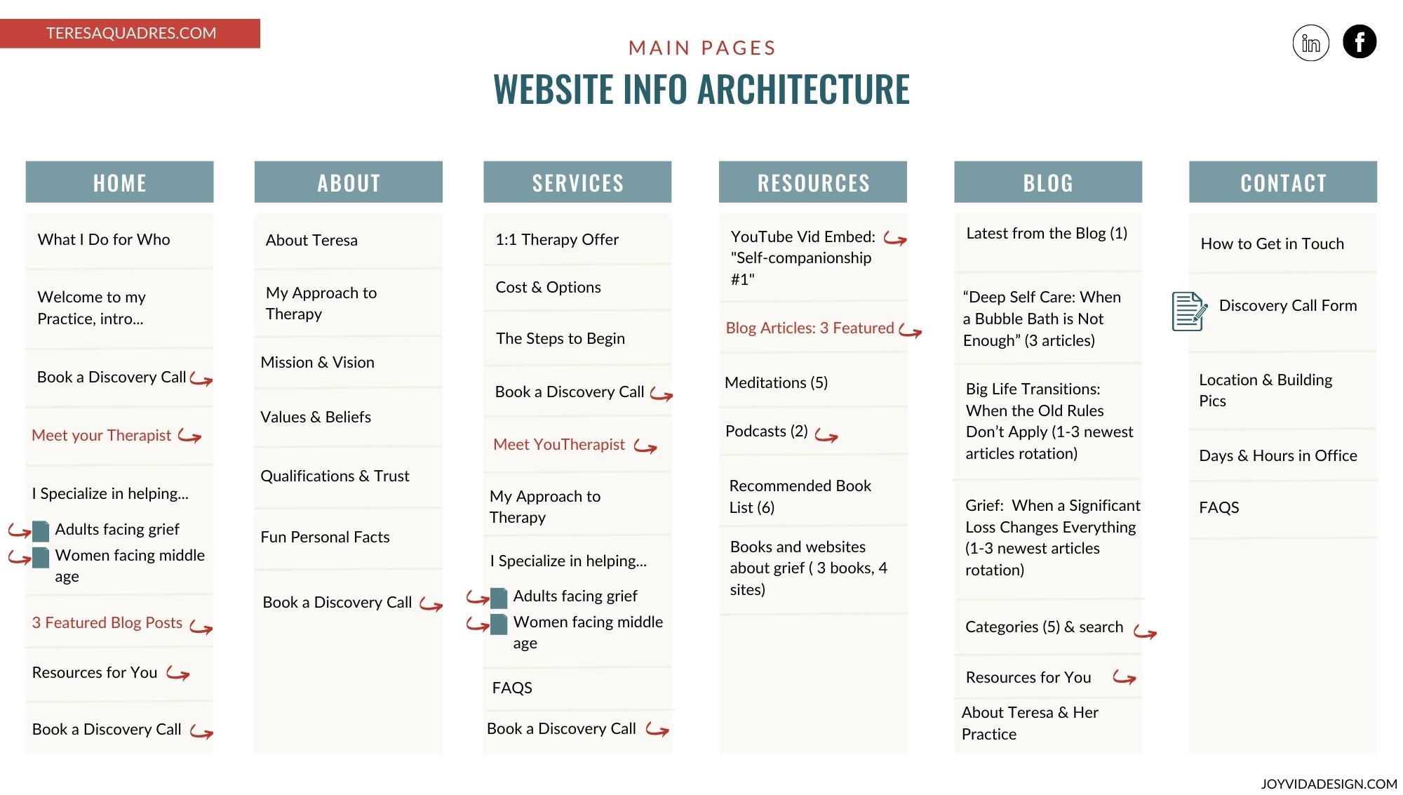
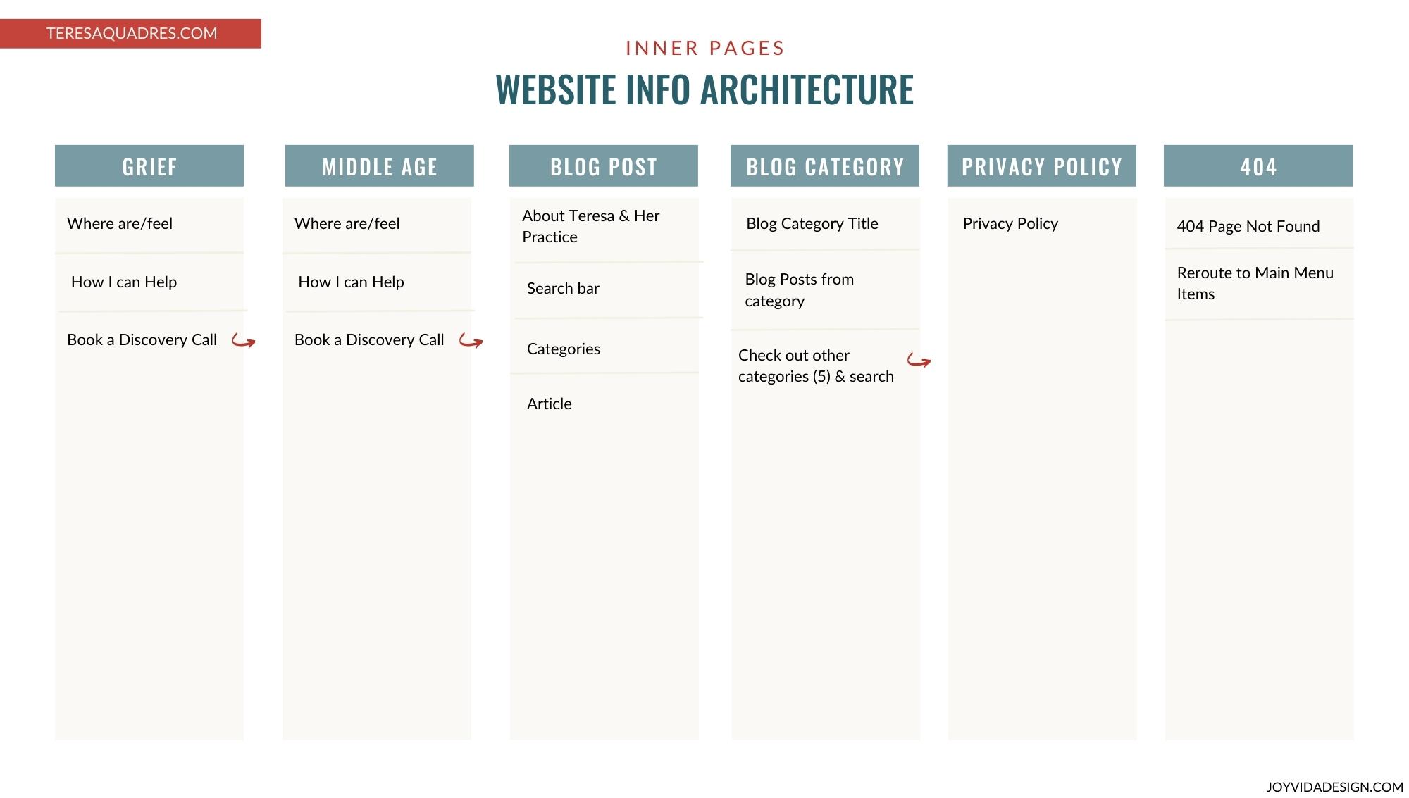
Next, we mapped out the website content, breaking it down into pages and sections all strategically organized for the most optimized user experience. Before diving into website design mode, it’s important that we are aligned with exactly what our client’s goals are for visitors landing on their new website such as primary and secondary calls to actions, as well as understanding what the visitors’ goals are when landing on the website, designing it to be as easy as possible for them to find the information they’re looking for.
Step 4: Therapy Website Design in Showit
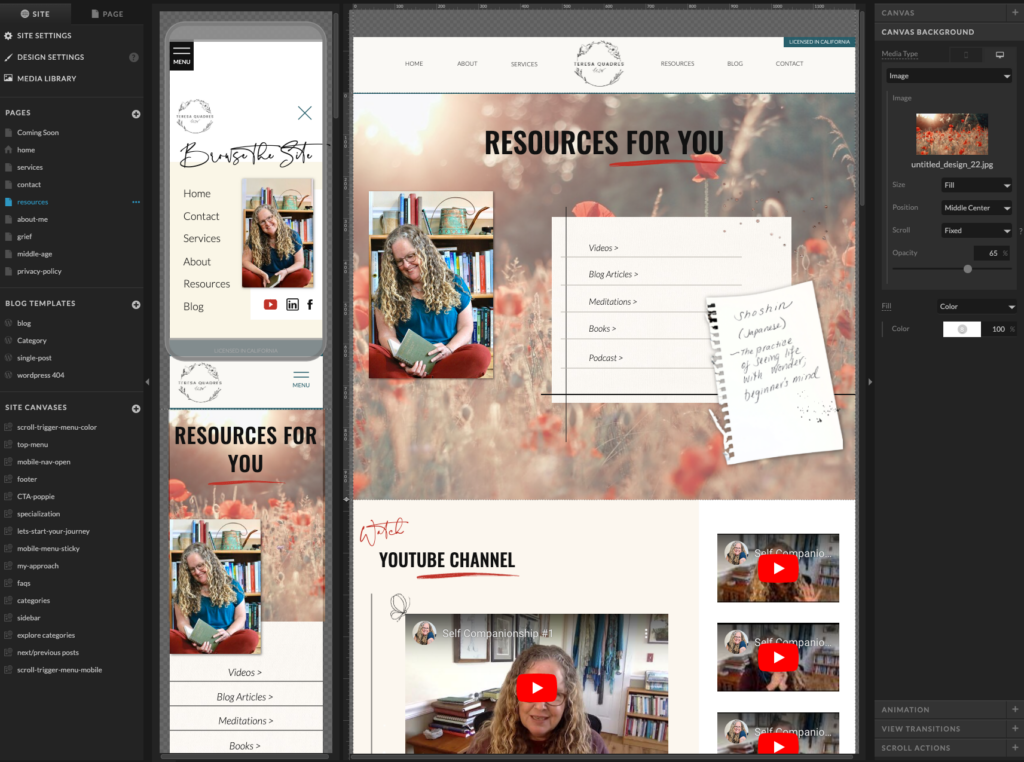
Now that we are clear on the website content, organization and navigation system, and goals for the website, it was time to design and develop Teresa’s new therapist website in the Showit website platform. My favorite part of this website redesign was the resources page because it challenged my creative and technical skills in a really fun way, and I was able to creatively go above and beyond for her such as surprising her by turning her audio guided meditations into stunning nature background scenes YouTube videos. The completely new resources page beautifully integrates her Therapy YouTube videos, book list, meditations, podcasts, etc. directly into the site in an accessible, engaging, and fun way. The end results left her speechless.
“My first goal, which is what started me on this venture, was to be able to provide more free content for multiple reasons. I had completely hit a wall with my ability to offer blogs, videos and audio meditations on my DIY website in an organized and accessible way. I almost cried when I saw the resource page Cassandra created. Not only was it built and organized in a way far beyond my technical capacity, but visually the design was far beyond anything I could have dreamed up on my own.”
Step 5: Therapy Website Design Final Transformation
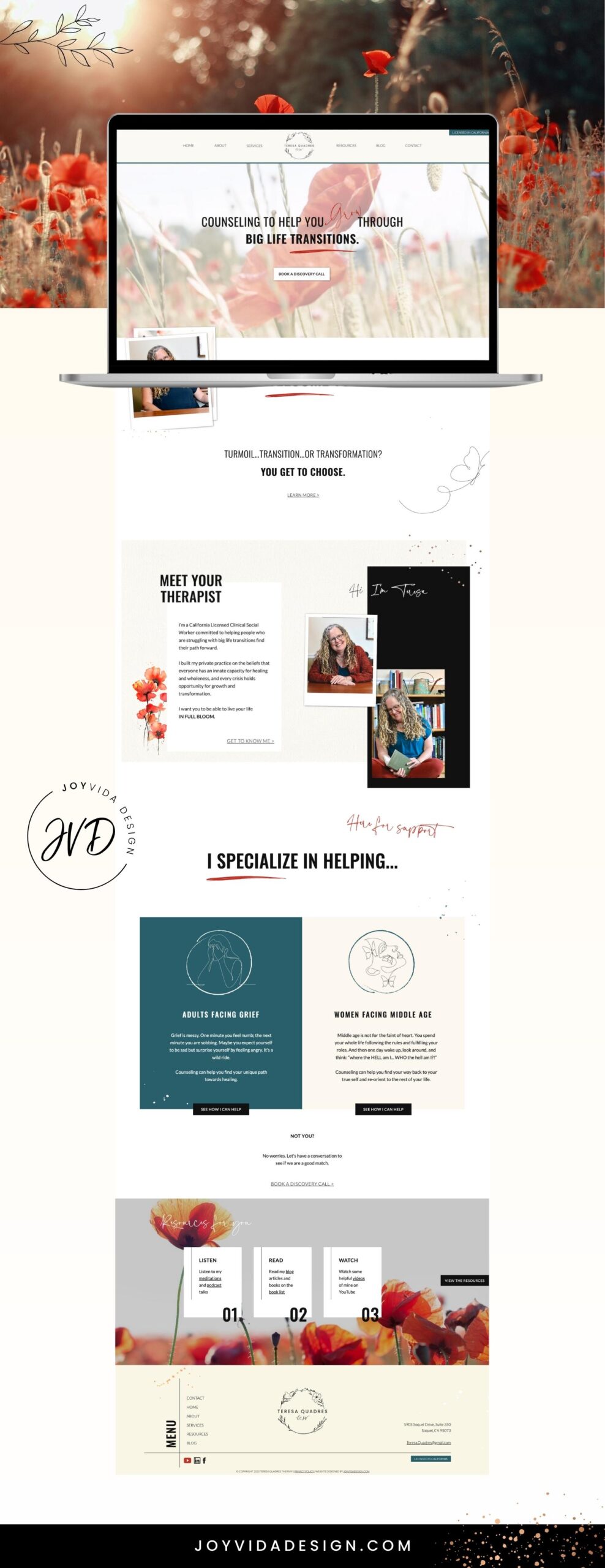
“WOW, Cassandra, I can’t even tell you how much this surpasses not just expectations but even my wildest imaginings! It’s gorgeous, and it does tricks I didn’t even know could be done! I almost wept watching the video. It’s hard to believe that jumble of ideas and pages of words and vague suggestions of imagery that I gave you turned into this exquisitely designed piece of work.“
Let’s Get into Some Q & A’s with Teresa
How does your NEW website compare to your old website?
“My original website was totally DIY, created with no background in design, branding or SEO. The new website, in contrast, is like a work of art that beautifully represents what I want to offer the world with my business. I was truly astonished at the final result: every single detail resonated with my deepest intentions for my work.”
Did we successfully accomplish your website goals for Teresa Quadres Therapy? What were they?
“I don’t even have words for how far the final website surpassed my expectations and blew past my goals. My first goal, which is what started me on this venture, was to be able to provide more free content for multiple reasons. I had completely hit a wall with my ability to offer blogs, videos and audio meditations on my DIY websit in an organized and accessible way. I almost cried when I saw the resource page Cassandra created. Not only was it built and organized in a way far beyond my technical capacity, but visually the design was far beyond anything I could have dreamed up on my own. My next goal was to shift my target population, but I was struggling to clarify my niche. Cassandra provided me with so much guidance and support in this area, and kept me on track, so she could ultimately create a site that truly speaks to my ideal clients. Finally, I knew I was in need of a general upgrade in design and SEO if I ever wanted to expand my offerings and grow my business. I had only vague ideas of what that might look like when I started working with Joy Vida Design, but Cassandra was able to translate that vague intention into a crystal clear vision. Now I have a website that is more authentic and unique and professional than anything I had hoped for.”
What was your favorite part about working together?
“I was truly surprised by how perusing my final website made me feel personally and professionally seen, heard and valued. Cassandra is a keen listener, and she seemed to hear and remember and keep track of every detail of what I told her about my hopes and intentions for my business. There were small and subtle elements in the final design that represented thoughts I had just touched on and preferences I had just casually mentioned. At the same time, the overarching themes, colors and design perfectly reflected my deepest and most heartfelt motivations in doing the work that I do.”

“The only thing that was more impressive and gratifying than the process of working with Cassandra was the end result: a unique and beautiful website that expresses the heart of my business in ways I never would have even dreamed of on my own. Cassandra is an absolute gem. I hope you will let her work her magic for you. Her passion shows up in every detail of her work, from listening skills to design skills to technical skills. Working with Cassandra is an experience that is both highly professional and deeply personal, efficient yet comprehensive, inspirational and FUN!“
– Teresa Quadres
If you’re ready to take your business to the next level with a website makeover, you can learn about my Showit website design package here. Schedule a free discovery call here to talk more in detail about how I can help you accomplish your website and business goals.
Hey there!
Therapy Brand and Website Design for Teresa Quadres Therapy
May 27, 2023
Blog Home